Sign me out on campaign advertising

Fall is such a lovely time of the year.
At least it would be if the leafy landscape weren’t littered with ANNOYING CAMPAIGN SIGNS.
Just once I would love to see someone run for office on a promise to actually fix the environment.
No, I don’t mean halt global warming. I mean pass a law to stop the insidious clutter of candidate cardboard.
Like that will ever happen.
Politicians and the flying monkeys who manage them are convinced that vast amounts of perfectly good scenery must be marred in order to win.
But I’m not so sure this is true.
In fact, I think campaign signs often broadcast messages that might actually interfere with the intended “Vote for X, Y or Z.”
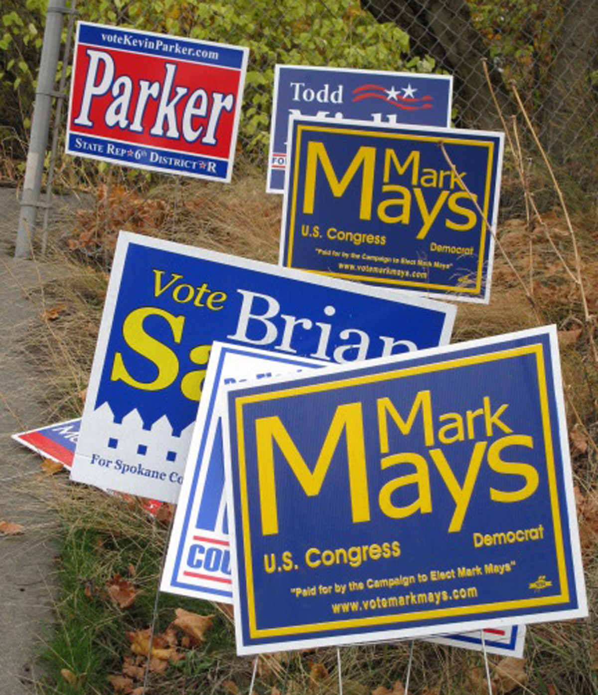
On Tuesday afternoon, I cruised around Spokane to critique and snap photographs of some of the area’s political signage. Here’s what I found.
•The best thing you can say about Kim Thorburn’s cartoon sign is that it does get your attention.
Of course, so does a guy in a gorilla suit jumping out of a closet.
The sign features a caricature of a scampering, briefcase-toting Thorburn along with the words “Elect Dr. Kim … Running for Healthy Government.”
Did I say caricature?
I meant defamation of caricature.
Which is why I get a mixed message every time I look at it.
Does the Democrat want a seat on the Spokane County Commission?
Or is she seeking a spot in our Sunday comics?
•Somewhere in the county there must be a print shop where all good Republicans march in lock step to get their campaign signs made.
And apparently this GOP sign mill offers only three color combinations:
Red, white and blue. White, blue and red. And the ever-popular blue, red and white.
Consider the signs put out by candidates John Ahern, Kevin Parker, Mark Richard, Todd Mielke …
I haven’t seen less originality since Milli Vanilli.
They should have just pooled their money and come up with one all-purpose patriotic placard. “Vote for the Republi-Clones,” it would say.
•Too bad Lisa Brown’s last name wasn’t Green. Or Pink. Or …
I’m guessing that the incumbent Democratic senator chose brown as the main color on her campaign sign as a way to underscore her last name.
But why on earth tones did she pick yellow as a background?
I can’t help myself. That color combination always reminds me of an old political joke:
Politicians are like diapers. They should be changed often and for the same reason.
The more I look at signs, the more questions I come up with.
Like …
Why is the McCain/Palin sign blue? Is this yet another concession that the red states have gone Obama?
And how about that old-fashioned typeface on Don Barlow’s re-election sign? That font would definitely be more at home on a Wild West wanted poster.
The voters want to know. Is the Democrat gunning for 6th District state rep Position 1 or sheriff of Dodge City?
And why does Brian Sayrs have his name hanging over a white fence on his Spokane County commission sign?
Somebody should tell the District 2 Democrat that being a “fence sitter” is not a quality a politician wants to be known for.
As always, of course, these observations are strictly the product of my subjective and infallible mind.
But after spending several hours examining the city’s political signage, I did come up with one truth no voter will argue with:
The only good campaign signs are the ones that have already been removed.