Designers suggest restraint when incorporating purple in décor

Home furnishing catalogs and decor magazines tell us that purple is all the rage, and top designers have been filling clients’ homes with everything from purple wallpaper and furniture to purple lampshades and throw pillows.
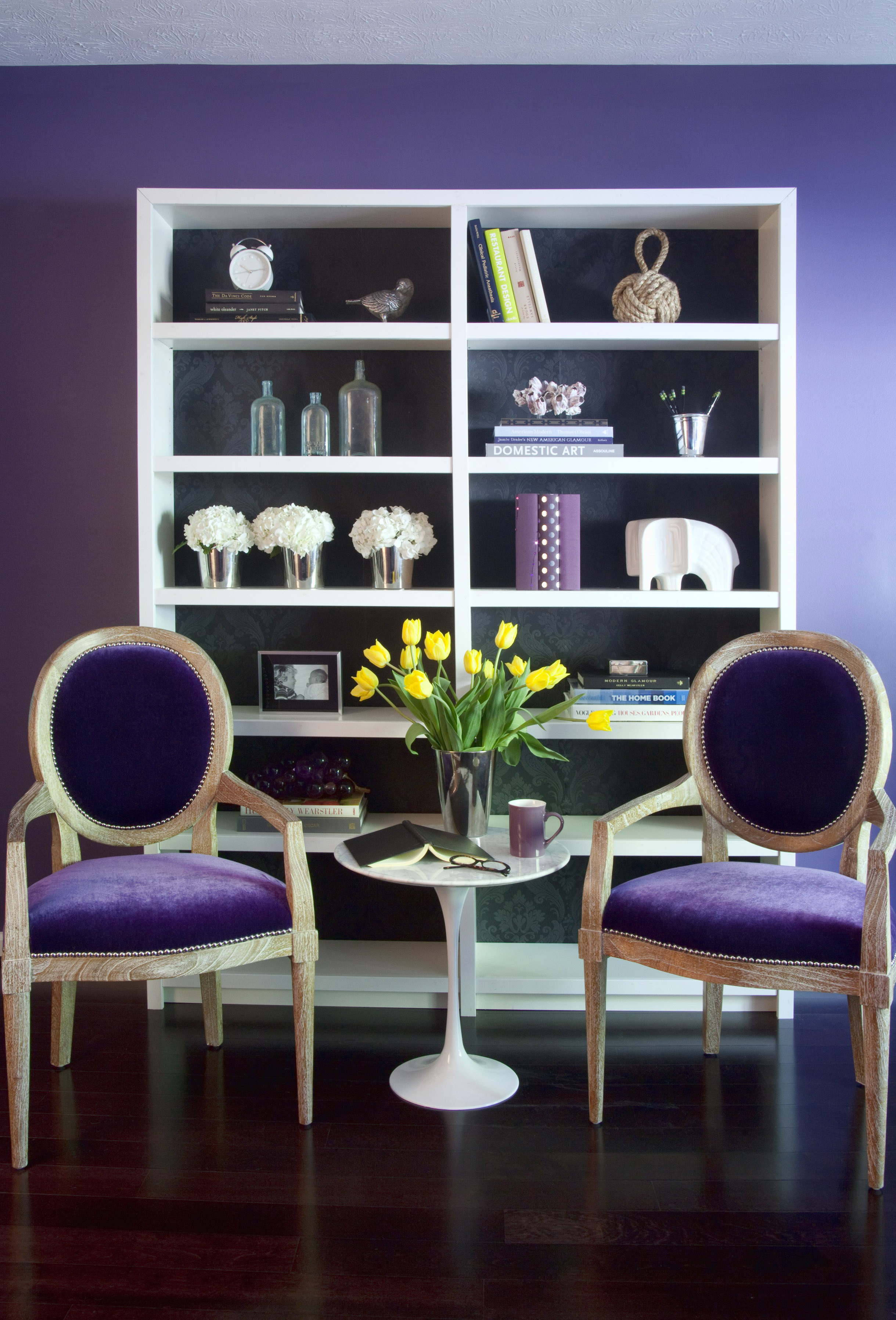
It can be a tough sell, says Betsy Burnham, founder of Burnham Design in Los Angeles, who has used purple frequently this year. Clients sometimes blanch when they hear “purple,” envisioning garish, overpowering hues, she says.
“Sometimes it takes putting the color up on the wall or buying a couple of yards of the fabric to convince them,” she says. They’re usually thrilled with the elegant results.
“I’ve done walls in a grey-purple and it’s super-sophisticated,” Burnham says.
It is true that purple has to be used wisely. “Too much purple can seem Austin Powers-ish or way too juvenile,” says Brian Patrick Flynn, founder of decordemon.com.
So how can you choose the right shades of purple and use them well? Burnham, Flynn and Sandra Espinet offer their ideas and advice:
Start slowly
No need to invest much if you’re not sure whether purple is for you. Buy several purple candles for your dining room or a purple throw blanket to drape over your sofa.
Espinet suggests bringing in some purple items like these during the holiday season, and then keeping them around after holiday decorations have been put away.
Another low-commitment approach is to bring in a lamp with a lavender lampshade to add a subtle purple hue to a room.
Choose shades wisely
“My rule of thumb is to use vibrant or bold purples strictly as accents, whereas muted purples or ones with lots of gray undertones can be used more generously,” Flynn says. “If you get your purples right, they can be warm and cool at the same time. My favorite shade is violet.”
Soft lilacs and grayish lavenders can be easier to work with, Burnham agrees. She advises homeowners to stay with very pale purples or dark, regal shades.
Save the boldest shades of purple for one important piece, she says, such as a “beautiful vintage chair in your hallway. Or do just the seats of your dining chairs in a great purple fabric.”
Not just a girl thing
All three designers point out that purple isn’t just for young girls’ bedrooms.
“Purples can take on masculine or feminine styles, depending on how they’re used,” Flynn says. “Plummy tones are usually my go-to shade for women. Blue-violets or dark purples are my first choice for men. … There’s a sense of regality to it.”
Pale lilac sheets with a white down comforter can look softly feminine. But pair those same sheets with a chocolate brown bedspread and the look is perfect for a bachelor’s apartment.
Purple in patterns
A solid purple wall can be overpowering, but Flynn points out that wallpaper in shades of purple can have a much different impact.
“Sometimes I will go ahead and do an entire room in a dark violet, but with fabric or textured wall covering, not paint,” he says. “Purple textiles seem to immediately evoke a sense of luxury, whereas purple paints can sometimes just be too much saturation with no texture to help warm it up and give it depth.”
Proper pairings
In the ’80s, purple was mixed with other strong colors such as teal and gold, Espinet says. Today, you’re more likely to see it combined with neutral shades, or see several shades of purple used together.
Flynn often pairs purple with grays and silvers for a modern feel. “I often use brown-grays with plum to create a moody, earthy feeling,” he says. “For modern homes, I love to play up charcoal, gray-beige and lavender.”
Where to put it?
“Purple is a relaxing color,” says Espinet, and can work well in just about any room — especially bedrooms and living rooms. But she does suggest limiting its use in the kitchen: Food, she says, just doesn’t look good with purple.