Designers offer advice for being bold
Striped staircases and lavender walls? They’re not just for high-profile designers anymore.
Home-decorating TV shows and glossy shelter magazines have many homeowners embracing the bold, unexpected use of color that cutting-edge designers love.
But creative color can be tricky. Three experts offer advice on doing it right:
Unexpected places
Bursts of color are perfect for areas that normally get little attention, says Cortney Novogratz, co-host of the new HGTV series “Home by Novogratz.”
Stairs, alcoves and unused corners of rooms, she says, are spots “that people don’t realize they can really dress up and have fun with to show a reflection of who they are as homeowners.”
For her show’s first episode, she painted a beach house staircase white with pink and blue stripes from top to bottom. This narrow approach to the second floor suddenly became bright and inviting.
Unexpected pairings
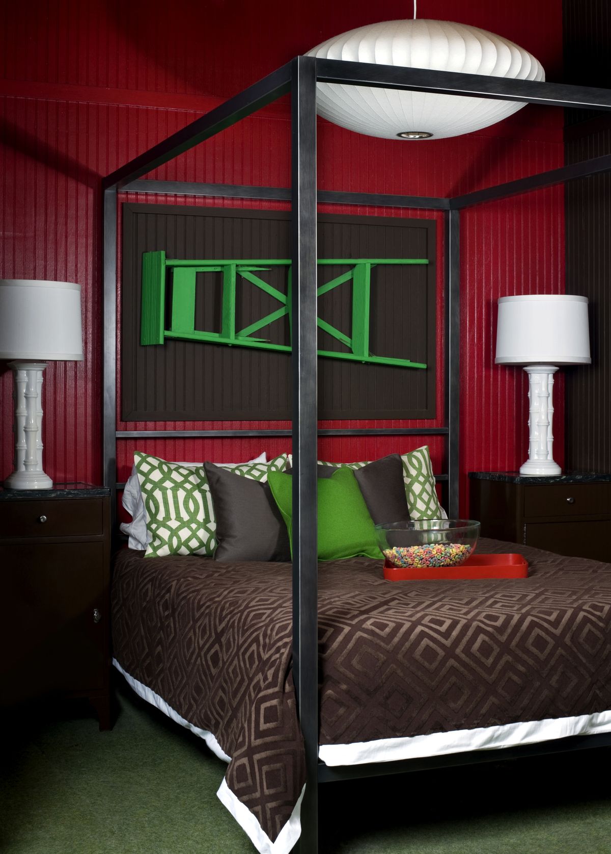
Black and white. Red and green. Brown and light blue. These common color palettes surface frequently in home decorating.
Freshen up these typical pairings by bringing in a third color no one would expect, says Brian Patrick Flynn, HGTV blogger and founder of DecorDemon.com.
“If you really want chocolate brown with pale blue, which has been done to death, then add something like celery green,” he says. “All of a sudden, it’s fresh and you’ve made it your own.”
If you love wild colors like bright orange but aren’t sure how to decorate with them, Flynn suggests using a bright hue alongside a very dark and a very light one.
Orange might be a disaster mixed with green and yellow, but it can look sophisticated when used with silver and dark charcoal.
Bold, not bright
Being adventurous with color doesn’t always mean using loud hues. Betsy Burnham, founder of Los Angeles’ Burnham Design, recently chose lavender for the entryway of a home in Beverly Hills.
Her client had expected the walls of this two-story space to be painted a classic neutral – maybe cream or taupe. Lavender was an unexpected choice, but the owner was thrilled: It gave the entryway subtle drama without looking outrageous.
Skip the paint
Paint is inexpensive and easy to apply, so it can be the perfect vehicle to bring in wilder colors. But Flynn finds that some homeowners are intimidated by choosing a bold or quirky color for their walls.
“They feel like it’s permanent, even though it isn’t,” he says.
If you prefer neutral walls, you can easily bring in edgier colors with furniture, window treatments and accessories.
Novogratz suggests another option: Choose vibrant pieces of art, then frame them in brightly colored frames.
She and her husband, Robert, who is also her design partner, sometimes take basic wooden picture frames and repaint them in a vivid red lacquer.
In the shade
No color is off-limits, provided you choose the right shade. Even pink doesn’t have to be saved for children’s bedrooms, Novogratz says.
A tip from Burnham: If you want to use a color like teal or chartreuse but are worried it will be overpowering, look for what she calls a “dusty” version of these colors – one that’s tempered by a bit of gray.
Balance with wood
The edgiest colors can be tamed nicely by pairing them with natural wood tones.
Burnham often adds furniture with black wood finishes to rooms where she has used intense colors.
Novogratz did the same in a master bedroom where she used a single shade of bright yellow for the walls and floor. A large wooden bed in the center of the room created a calming break from the energizing yellow that filled the space.
Whatever you do, says Flynn, give yourself permission to experiment and indulge your creativity.
“Every time I do my own space,” he says, “I think of it as a canvas where I can experiment with completely unusual color combinations.”