Design Recipes: The best colors for fun, festive rooms
Whether for a children’s room, family room or a space you’re looking to incorporate bold, vivid looks, a fun and festive color scheme can be a welcomed pick-me-up. Full, bright colors can make a statement and work well blended with neutral colors such as taupe, brown, black and gray.
Don’t know where to start? The best springboard is to find an inspiration piece and build a color palette around it. Perhaps it’s an area rug, piece of art, an accent chair or your favorite color. The key is to pick a color you love, and don’t be afraid to mix and match and use complementing colors.
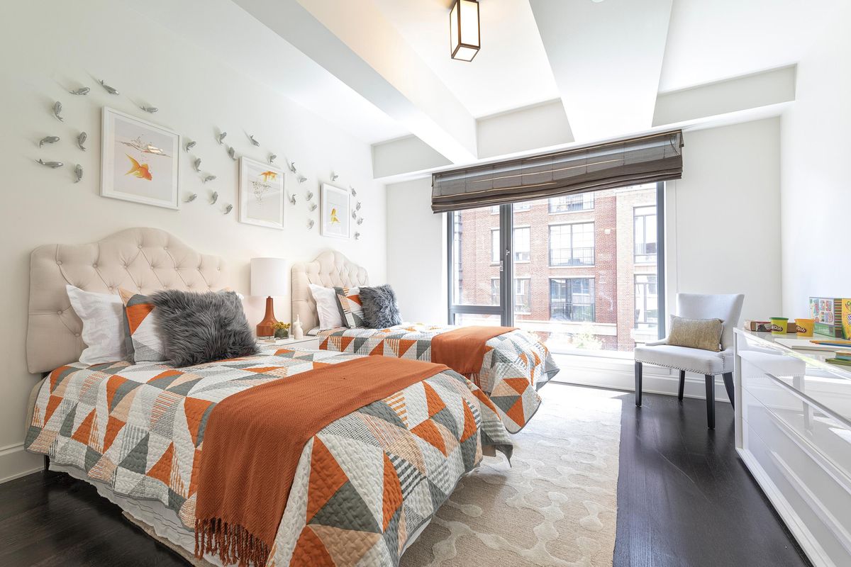
Orange
Bright and friendly, yet capable of being sophisticated, orange is one of the most versatile bright colors. You can pair orange with yellow in a family room or playroom, or with charcoal gray or white in an adult space for a sleek, modern look. Not sure which shade to pick? Consider brighter tones if you are looking for a more playful, youthful look, and more muted tones such as a burnt orange for a more sophisticated look.
Yellow
Yellow is a great choice, especially if you are a fan of gold and brass finishes, one of the hottest finishes in home decor right now. Yellow can also help perk up a space. Yellow can be both youthful and warm and welcoming. Consider a bright and bold tone similar to the color of a lemon if looking to brighten a space. Darker shades such as mustard can still mimic sunshine and help reflect light, while also feeling warm, light and inviting. Yellow pairs well with white and gray.
Pink
Powder or pastel pink is one of the more popular pastel colors. Pink pairs extremely well with brown and gray. Pink used in spaces that may be smaller in size, such as a home office or children’s bedroom, can also add a sense of freshness when paired with foundation colors like white. A great use of pink is in accessories and accents such as coffee table books or toss pillows.
Green
Green can be a tricky color, in large part because of how it may be affected by other colors and even natural light. One of the main attributes of many shades is a lot have yellow undertones, which help even darker shades feel light and airy. Looking for an even lighter shade? Consider a green that may have white undertones and may be closer to a pastel. Pastel or mint green can be a successful color choice like other pastels, without appearing medicinal if paired with grounding colors such as gray, brown and black. You can always incorporate various tints, tones and shades of green to make a space feel cohesive.
Purple
A color often associated with royalty, purple is often confused as being overly youthful. The reality is purple is a rare color that can be both playful and sophisticated, even with muted tones. Pair purple with foundation colors such as black, brown and gray.
Cathy Hobbs, based in New York City, is an Emmy Award-winning television host and a nationally known interior design and home staging expert with offices in New York City, Boston and Washington, D.C. Contact her at info@cathyhobbs.com or visit her website at www.cathyhobbs.com.