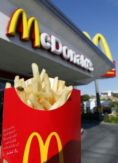
Your logo here: How a logo becomes an icon

NEW YORK — In almost every corner of the world, golden arches symbolize something. So does a red bulls-eye. The same is true for a half-eaten apple. Ditto for the well-known swoosh.
The most iconic company logos such as those of McDonald’s, Target, Apple and Nike are visual cues that are seared onto people’s consciousness without their even realizing it.
That kind of influence has always been valuable, but now it’s priceless. Companies are fighting for the shrinking attention spans and wallets of consumers who increasingly get their information on tiny cellphone screens. And as companies expand into emerging markets, images matter more than words. The brand identity that a logo brings can pay off, and companies know it.
That’s why Ford’s executive chairman Bill Ford described the day that the automaker got back its signature blue oval as “one of the best days I can remember.” The company gained back the logo along with other assets in May after having used them as collateral for a $23.5 billion loan six years earlier.
What’s better, people like logos. LogosQuiz, a smartphone application that tests people’s knowledge of company logos, is one of the top free games on Apple’s iPad tablet and iPhone. And a short animated French film made up of nothing but logos called “Logorama” won an Oscar in 2010.
That kind of hype translates into dollars for companies. Interbrand, which tracks brand values, of which the logo is a key part, values Coca-Cola’s brand at $71.86 billion; McDonald’s at $35.59 billion, Nike’s at $14.53 billion and Ford’s brand at $7.5 billion.
Here is a look at how companies create and maintain iconic logos.
Target: Hitting the bulls-eye
Target Corp.’s bullseye was born when department store operator The Dayton Co. decided to open a discount chain in Minneapolis in 1962.
The company at first considered using a bullseye with a few bullet holes in it. That, however, didn’t seem appropriate for a family store.
The first logo had the name “Target” written in black over a red and white bullseye with three red circles and two white circles. The store’s first print ad campaigns used the Target as their theme with the tagline: “Aim straight for Target discount stores.”
The bullseye was simplified in 1968 with a red center, one white circle and one red circle.
It’s one of the strongest brandmarks in the marketplace.
McDonald’s: Inspired by architecture
Would McDonald’s Corp. be the world’s biggest fast-food chain if it kept its original symbols - the McDonald family crest or “Speedee” the chef - instead of the Golden Arches?
McDonald’s was started in 1948 in San Bernardino, Calif., by brothers Dick and Mac McDonald. But by the early 1950s, the Oakbrook, Ill.-based company began to franchise and grow rapidly when businessman Ray Kroc bought the company.
In 1953, architect Stanley Meston designed the first franchised building, in Phoenix, Ariz., with red and white tiles and a sloped roof. Dick McDonald thought the design was a bit boring, so he sketched in the now-famous yellow arches, dubbing them the “Golden Arches,” according to Mike Bullington, McDonald’s archivist.
But Meston didn’t like them. So McDonald’s hired sign maker George Dexter to create them. He added in yellow neon and the arches soon became emblematic of McDonald’s restaurants.
Gap: Lost in translation
Not every logo is a hit, of course, especially when a company tinkers with a beloved one. In 2010, without any announcement or warning, Gap Inc. changed its white-type-on-navy “blue square” logo, which it had introduced more than a decade earlier. The new logo had a lowercase “gap” with a blue box in the right hand corner.
Officials revamped the logo at a time when the retailer, which had brought khakis to the masses in the 1990s, had lost its fashion edge. Sales were slipping.
Gap officials were hoping the new logo would communicate to customers that it was updating its image.
After the new logo was out, Gap fans voiced their discontent. A fake Twitter feed, (at)GapLogo, even was created to lampoon the move (it currently has more than 3,600 followers).
“We remind clients that a logo is not going to change people’s minds, but it can stay in the mind and burn into memory,” said Sagi Haviv, a partner at Chermayeff & Geismar, a firm that designed the Chase bank logo, among others.
Aetna: Change can be good
Sometimes, though, a revamped logo is just what a company needs.
Aetna, the big insurer, revamped its logo in January to address changes in the health care industry. Health care legislation that is likely to be phased in over the next several years includes a system in which consumers can buy insurance through new online marketplaces.
For insurers like Aetna, that means they will have to more actively market their products to consumers — not just businesses.
The result? A new logo - purple wordmark with a lower case font and linked letters. The stick figure is gone.
The logo has gotten good reviews in the design community and employees, an important group to win over.