Split Airway Heights council OKs new logo
Even simple expressions of art are subjective.
A divided Airway Heights City Council – a mini-microcosm of the art world – showed that what works for some, doesn’t work for others when the council voted 4-3 in favor of a new city logo. The color design has been showing up on city stationery since it was approved at the April 4 council meeting.
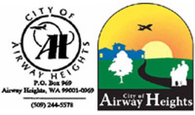
The logo shows a family standing on a path that leads to a housing development. There’s also a tree, a sunrise and a jet in the illustration.
It replaces the logo that had been around for at least two decades, and one where the B-52s were “whited-out” in 1994 after they left Fairchild Air Force Base.
Today’s logo is the perfect picture of Any Town, USA.
But, according to Mayor Dale R. Perry, there is nothing distinctly Airway Heights in the logo. The city of Spokane, for example, displays the Monroe Street Bridge in its logo. A golf course and pine trees make up the Liberty Lake logo.
“The one thing that stands out in Airway Heights is the green and white water tower,” Perry said. “It’s nothing fancy, but it’s something everybody recognizes.”
The water tower didn’t make it into the new logo.
Perry and council members John Holloway and Matthew Pederson voted against the logo. Council members Patrick Rushing, Stacy Daniels, Don Mitchell and Rick Jacks voted for it.
Holloway said he’s not satisfied with the new logo because “it doesn’t adequately portray what we’re trying to portray.” Holloway said he’d have preferred to emphasize the industrial growth of Airway Heights rather than the residential side.
“Housing is not going to be the mainstay of the city,” insisted Holloway, an Airway Heights resident for 31 years.
The logo was created by Gibby Media Group, a Spokane company that began the work at the end of 2004. City Manager Chuck Freeman said the cost was $24,000. He said the city still is figuring out how much money it will take to change stationery, business cards and anything else with the old logo.
Cory Kerr, vice president of production services and one of the designers, said symbolism is displayed throughout the logo. The tree and housing show growth. The family represents community. The jet, which is climbing, represents the upward direction of the city, while the sunrise represents a new day.
Kerr said one of the reasons the water tower was not considered is because it is neither aesthetic nor a recognizable icon, unlike Spokane’s Clock Tower.
Northern Quest Casino, meanwhile, which helped bring people to Airway Heights since opening in December 2000, also wasn’t considered for the logo. Kerr said too many people have different views of the casino.
He said the logo is meant to convey a message and not promote a business.
Rushing, who backed the logo change, said it does indeed give a sense of Airway Heights’ pathway to the future.
“Showing the water tower… . That’s not acceptable,” he said.
The design also is being coordinated with new signs planned for the city’s 50th anniversary celebration.
Spokane county commissioners declared the town incorporated on April 19, 1955. Freeman said $50,000 has been set aside for the celebration, including $30,000 for new welcome signs at U.S. Highway 2 and Craig Road, and at Highway 2 and Hayden Road.