Design Recipes: The beauty of blue and green
When it comes to cool colors such as blue and green, there are various reasons why they work well together.
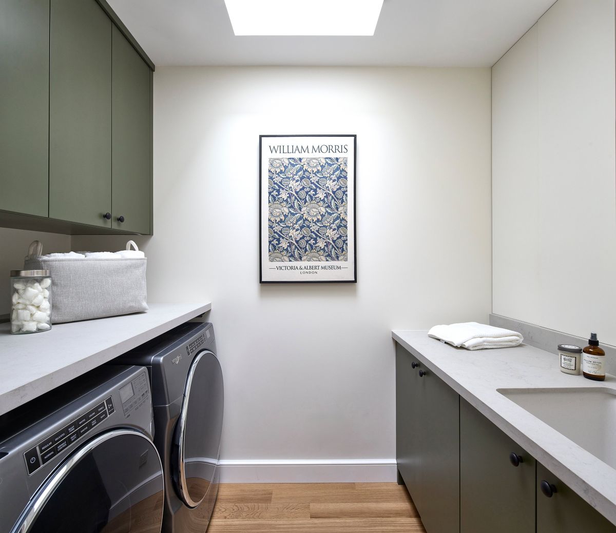
They are both soothing colors in which their different tints, tones and shades can take on different nuisances. Dark shades of green can work well with deeper shades of blue for a smoky, luxurious feel. Lighter colors such as pale shades of blue and green work well together for a more nautical or aquatic tone.
A key designer “go to” color is often green. The reason is there are so many ways to infuse green into an interior, from nature elements such as greenery to decorative items such as artwork, accents and accessories. Blue is a “staple” color in which there is a tradition and formal element. Blue is also often considered to be a universal color that can be paired well with other colors, especially green.
Paint color selectionPaint colors can be tricky, but an often-accepted color rule is to pair colors of a similar tint, tone and shade. In other words, pair colors that are more on or near a similar row on a paint strip, which typically signals that a color has the same or similar amount of black or white in the creation of its paint mixture.
Blue and green play especially well together because of their similar color undertones. When heavy yellow undertones are added to green the result is warmth and coziness, which also happens with blue. Conversely, cool shades of blue and green work well together.
Tips for introducing blue and green into your décorWhen it comes to incorporating blue and green into one’s decor, a design hack is to have a bit of a color imbalance so you don’t create an overly “matchy matchy” color palette. Instead of having a 50-50 design intent, opt for a sprinkling of various shades of green and blue throughout, using neutral furniture pieces as the foundation for the color palette.
Looking to add a warm “pop of color”? Tertiary colors are those colors that are also combination colors on the color wheel, such as yellow-orange or red-orange. They are great compliments especially when one is looking to warm up a space.