An argument for the color that makes everybody look (and feel) good
Last year, for the first time ever, Pantone, the institute that predicts color trends, chose two colors – Rose Quartz and Serenity – instead of its customary one. This year, the company returned to tradition by choosing a single shade, Greenery, an arresting hue of green (think Kermit the Frog) that Pantone says is “refreshing and revitalizing” and “symbolic of new beginnings.” I wish Pantone had broken with tradition again and for the first time repeated a color, and one in particular: Rose Quartz.
Rose Quartz is a soft light pink that, according to Pantone, fulfills “our yearning for reassurance and security.” If you ask me, it’s just the sort of calming color our country needs right now. I say this from experience. The first apartment I rented out of college had a Greenery-ish bedroom; it was a tough year. Bright greens are not restful. They are can even be anxiety-inducing.
Rose Quartz has the opposite effect of Greenery. (In fact, the two colors literally sit on the opposite side of the color wheel, which actually makes them complementary.) It’s not a flashy, bright Barbie Dreamhouse kind of pink, but rather a gentle blush tone like that of ballet slippers, Band-Aids and seashells. And if you think it’s a girlie shade, think again. Pink hues such as Rose Quartz tend to have gray undertones, so they are more sophisticated and less saccharine than other pinks.
Aside from being calming, these pale-pink tones have another positive effect: People look good in them. Blush tones complement most skin complexions, so they work well on walls or as lighting. The famed New York restaurant La Grenouille is known for its rosy glow, which comes not from guests drinking pink champagne but rather from the pink lightbulbs in all its fixtures.
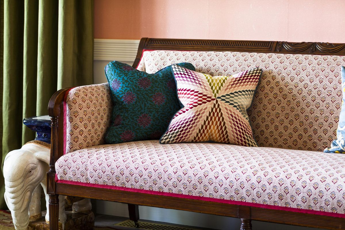
As for the impact of pale-pink walls, I experienced firsthand their flattering glow when I walked into the living room of interior designer Katie Ridder and her architect husband, Peter Pennoyer, in Upstate New York. I had seen pictures of the pink room in their recently published book, “A House in the Country,” but the photos did not do the room justice. Ridder covered the walls in custom-colored de Gournay tea paper, which gives the walls immense texture and depth, but the color on its own makes the room one of the warmest and most inviting I have ever been in.
Of course, not everyone has access to custom tea paper, so Ridder suggests using Benjamin Moore’s Brighton Rock Candy to replicate the look.
However, like all paint shades, there is not one that looks good in every room, so it’s best to try a few samples. Other paint colors worth trying are Pink Ground, Calamine or Middleton Pink from Farrow & Ball or Tissue Pink from Benjamin Moore.
If pink-hued walls are too much for you, you can give the color a try by adding blush-colored accessories or upholstered pieces. Modern-steeped companies such as Ikea and West Elm have plenty of rosy upholstered options, which is not surprising; dusty pinks complement the light woods that have been made popular by the recent influence of Scandinavian design.
And if you are worried about how these pinks will pair with your existing decorating scheme, know that they work well with just about any other color: grays, browns, blues, reds and, yes, even greens.
Mayhew, a “Today” show style expert and former magazine editor, is the author of “Flip! for Decorating.”