Why do romance covers all look like this now?
Where have all the torsos gone? The photorealistic “clinch cover,” featuring lovers mid-embrace, is a critically endangered species. Fabio? Hasn’t been seen around these parts in years. But he hasn’t been traded in for a younger model; models generally have vanished from the romance shelves. They’ve been deposed by a new breed: the vector couple.
The vector couple has all their clothes on. Their faces and bodies are rendered minimally. (This is due to the influence of vector design, which composes in points and equations, not pixels, and emphasizes shape over texture.) They’re anchored at a chaste distance on a bold, unbroken expanse of color. They bookend a short, punchy title printed in a condensed font that’s easy to read on a screen. This style of cover has grown dandelion-thick over the literary terrain, becoming the genre’s dominant look. It’s a whole different kind of graphic.
Monique Aimee, an illustrator who has worked on covers for Timothy Janovsky and Casey McQuiston, said the key to this pared-back style is communicating the novel’s sensibility – earnest but playful, not taking itself too seriously – without getting in the reader’s way. “I love making my work pretty flat and seeing what I can get away with to still convey all the details I need to, but in a very simplified way,” Aimee said. “When you’re reading a book, you are imagining the whole thing happening. I want space for people to be able to do that.”
These covers speak to the rom-com audience’s yearning for a simpler, less tech-mediated time, when meet-cutes felt possible, said Julie Schrader, associate creative director for romance at Sourcebooks. “Those simple, bright covers are so eye-catching and safe and comforting,” Schrader said. “The outside looks person-next-door-ish – but the insides might be super spicy.”
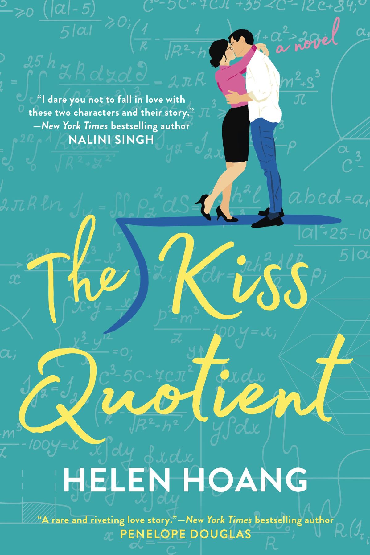
The trend dates to the late 2010s, when a cluster of upbeat contemporary romances became breakout hits: “The Hating Game” by Sally Thorne, “The Wedding Date” by Jasmine Guillory and “The Kiss Quotient” by Helen Hoang. Back then, Thorne wrote in a recent Instagram post, “The illustrated cover seemed to stick out like a sore thumb on bookshelves.”
Uptake was quick, driven in part by the industry’s push to feature more diverse characters – an expansion outpacing that of stock photography, which mostly portrayed white, heterosexual couples. Colleen Reinhart, an associate art director at Berkley, recalled that in the publisher’s internal discussions of Hoang’s book, about a woman on the autism spectrum, “they wanted something that felt fresh – something different, maybe, than what was expected.” An unconventional illustrated cover hinted at the outlook of the writing within.
This style helped authors reach beyond the core romance readership, drawing in “people that may have been a little intimidated by, let’s say, a photograph of a shirtless man, or like, really in-your-face abs,” said Vi-An Nguyen, art director at Penguin Random House.
It quickly became a signal of broad appeal and a common visual reference for publishers positioning a new romance as a mainstream attraction. The prevailing logic, Nguyen said, was that “there’s no reason why we need to limit something to people who are familiar with the old-fashioned design language of ‘the clinch.’ ”
Commissioning an illustration tended to be less expensive than setting up a photo shoot – a happy development for traditional publishers as well as the huge number of self-published authors working in the romance genre, who wanted their books to blend in with the crowd. “That’s part of why this trend has stuck around: It sells, and it’s cheaper,” said Nathaniel Roy, author of the newsletter “A Book Designer’s Notebook.” “And so when you have those two things together, they’re gonna milk that till it’s dry.”
Budgets aside, cover trends don’t take hold unconsciously. Recognizability is crucial. “You’re looking to mirror what’s out there,” designer Neil Swaab said. “Success is going to breed other success. Book covers are primarily a marketing tool as much as they’re an art – and they really are an art.”
“If you walk into a Barnes & Noble today,” Nguyen said, “you’ll see tables of all these colorful books, and there is this very strong design language. We want to be able to be on that table and to be familiar to that reader. But also not have your eyes glaze over it because it looks so similar to everything else.”
Within the fandom, the vector couple can be controversial. “There’s a big divide between old-school romance readers and newer, younger readers coming from TikTok, who were kind of like, ‘I’m embarrassed to carry around a book that looks like a romance, and these books look safe,’ ” said Jennifer Prokop, who co-hosts the podcast “Fated Mates” and reviews romance for Kirkus, a publishing industry magazine.
Some also complain that this style makes it difficult to tell how sexually explicit the story will get, Prokop added. “Now that they all kind of look like this – whether it’s like a really high-heat, really sexy romance versus a sweeter story with younger protagonists in college or whatever – sometimes it just feels like the cover is not going to really tell me anything.”
Consumer fatigue alone might be enough to trigger some adaptive radiation in romance covers. Like Darwin’s finches developing their beaks, new styles are taking hold. In what Prokop calls the “modern clinch,” the illustrations riff on the traditional design by having the couple embrace around a lottery ticket, or because of an archery lesson, or while they’re in spacesuits. Other covers reference other styles of drawing, like Archie comics, or pulp sci-fi, to create a distinct visual brand for the author.
Covers are now more likely to highlight character traits that can’t be conveyed in a simple silhouette, Nguyen noted, like their profession, their racial or ethnic backgrounds, or their body size. Readers are starting to crave more specifics: “Over the last five years or so, we get to see faces, and a little more detail.” Within her own designs for Rachel Lynn Solomon’s novels, over time, the characters’ features have become visible, the setting more grounded. For Solomon’s “What Happens in Amsterdam,” being published next week, the characters are surrounded by tulips.
Will we live to see the return of the photographed romance cover? Schrader, of Sourcebooks, suspects that illustration won’t be displaced. “Listen, it could happen!” she said brightly. “Trends are trends. It could come back.”