Designers say ‘unexpected red’ really works. Here’s how to use it.
For proof that everything old is new again, look no further than one of the latest viral design fads: placing a red item in every room – even (or especially) if it doesn’t match.
“It’s a trend that’s been around for years, but it’s just kind of going through a renaissance right now because of TikTok, I guess,” said designer Mark Eckstrom of Studio Eckström in Omaha. Eckstrom often employs a hint of the heady color in small ways, such as decorative trim (a red tassel on a cabinet key, for example). “My mother was an interior designer as well, and she always espoused that you should always have unexpected red in every single room.”
It’s back because it works.
“Splashes of red really do just make anything mysterious, sexy even,” Colette van den Thillart, a designer in Toronto, said in an email. “Red is so dynamic, dangerous and commanding. It can set an environment alight, which is why this trend makes total sense to me.”
Washington, D.C., designer Annie Elliott used red on a wall of bookcases in the family room of her rowhouse – and nowhere else – to create a moment of surprise. “The thing about red, whether it’s lipstick or a dress or anything in fashion, is that it’s always timeless,” Elliott said. “Because red is kind of classic, it’s a safe accent. I mean, red practically equals accent color, right? I think a lot of people are scared to decorate with such a strong color.”
To that end, we got advice from the pros on how to do red right.
Clash on purpose
The key to “unexpected red” is exactly that: It should be unexpected. “This leans into my one and only dictum in design – that you have to ‘(expletive) it up,’” Jacob Laws, a designer in Charleston, S.C., said in an email. Doing so gives a room a feeling of needed approachability, he noted. “There’s nothing worse than a homogenous and boring space, one that is ‘too darling,’” Laws said. “To avoid any matchy-matchy hellscape, a feel-good piece of the puzzle is red.” Even in a small dose, the color helps a room feel good emotionally, Laws said. His go-to: wrapping a lamp cord in red fabric, which is subtle yet “turns up the endorphin meter.”
The right red is a bit wrong
Eckstrom is using Sherwin-Williams’s Chinese Red on the interior wall of delft blue dining room glass-front cabinets in a client’s 1920s home in Omaha. He references fashion editor Diana Vreeland, who used so much red chintz in her New York apartment that she called it her “garden in hell.” “She said her entire life had been in pursuit of the perfect red because it’s such a hard color to get right,” Eckstrom said. “If you choose a red from a paint deck, it’s just going to look flat and lackluster. It has to be a mix. … It has to be this kind of layered red.” (To that end, Eckstrom often applies a glazed finish, such as a brown stain, to red paint.) Adding that little bit of quirk is vital to getting a red that’s not cloying. “Going back to Vreeland, she said that she would always tell people, ‘The best red is to go copy the color of a child’s cap in any Renaissance portrait.’ That would be the perfect red because it’s so nuanced,” Eckstrom said.
Small is strong
Just a whiff of red is enough to have an impact and lead the eye, Eckstrom said.
“I like to use Chinese lacquer tables nestled between two chairs or next to a sofa,” said Keith Carroll, a designer who works in New York and New Orleans. “It brings some nice vibration in a space.” (Carroll also recommends a red lacquer tray on a coffee table, or red pillow backs that provide “a hint of the color peeking at you,” he says.)
Eckstrom often places a piece of antique cinnabar on a mantel or coffee table. “It’s just something that grounds a tableau, and it’s always beautiful and it’s storied,” he said. “There’ll always be great conversation about how you acquired that piece.”
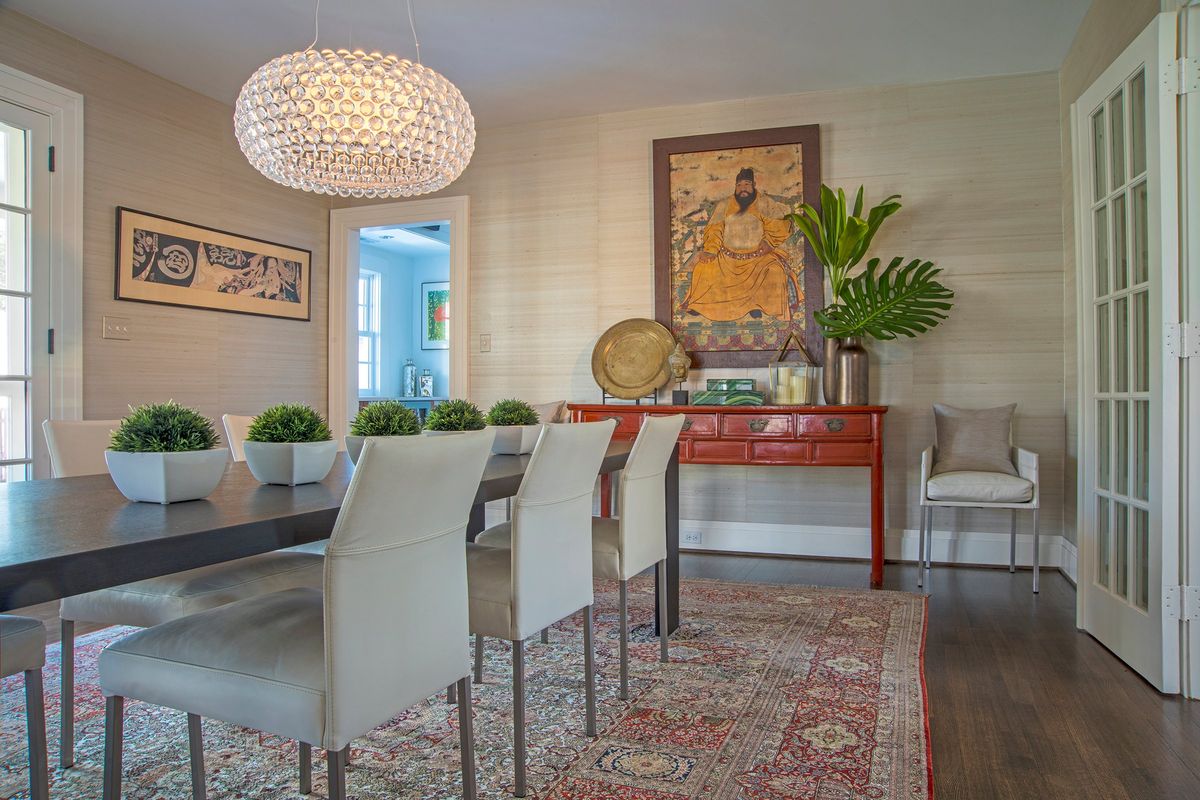
Include other bold colors
“When you have a room with no color in it and then you put in some red, it looks cheap and thoughtless,” Elliott said, pointing to red throw pillows tossed in a beige-on-beige living room as an example. “I think it just looks like you’re trying to take a shortcut to create an interesting room. And it is not working on me – the jig is up!” Instead, she recommends including it in a room with other bold colors; she has placed a cherry red vase in an emerald green foyer, for example, and a red lacquered console in a dining room with a densely patterned rug. “To me, that’s how you bring red in a fresh way: to clash it with other things.”